NHL Standings Heatmaps Dashboard
I have a ongoing interest in data engineering and visualization, and when I have time for personal projects, I enjoy using Python to pull and display real-time data. As the NHL 2024-2025 season entered its home stretch, I decided to build a dashboard that would present current division standings in a more engaging way.
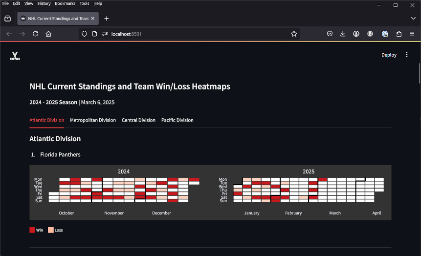
Late in the season, I was looking for a fun hockey-related project. I had been following the standings closely and found myself scanning the standings each day to spot teams with long winning or losing streaks. This gave me the idea to build a dashboard that would not only show the standings, but also highlight streaks visually, instead of just listing them in a table.
I had recently started using Postman to explore APIs and discovered an unofficial, undocumented NHL stats API. While it wasn't formally published, the schema was available through Postman and easy to work with.
After sorting out the necessary API calls, I looked for a way to create a calendar heatmap to represent streaks. None of the popular Python charting libraries offered exactly what I needed, so I searched GitHub and found a library built on Plotly that fit the bill. However, the library was designed for full calendar years, which created too much empty space since the NHL season spans Fall to Spring.
I forked the repository and customized it to display only populated months for the current season. I also created custom color schemes in Plotly, matching each team's uniform color palette.
Finally, I built and deployed the dashboard using Streamlit. On load, it polls the API for the latest standings and displays them in divisional tabs, each showing teams in rank order with their corresponding win-loss streak heatmaps.